Discover
Ask students what they thought of the existing website.
A client project through Studio Hackspett, redesigning DISK student union's website to make student information easier to find, easier to scan, and easier to maintain across Swedish and English content.
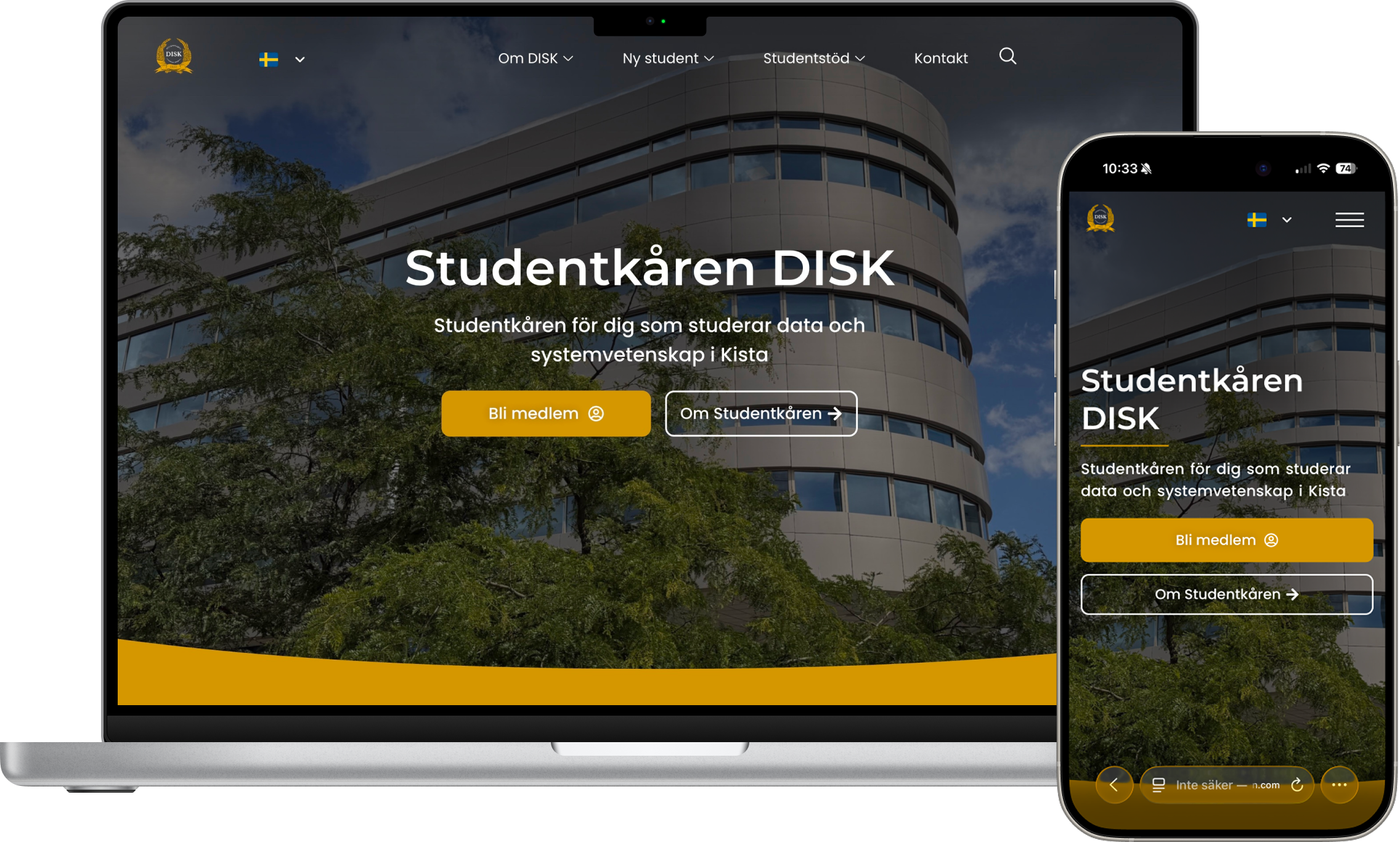
DSV has around 5,000 enrolled students each semester, with around 1,000 new students arriving every year. Because of that, the DISK website needed to work especially well for first-time visitors who may not know what DISK is or where to begin.
The project began with informal student feedback and moved into information architecture, Figma exploration, final visual direction, and implementation in the client's existing website stack.
Ask students what they thought of the existing website.
Synthesize recurring issues around awareness, structure, mobile, and language.
Create early and refined Figma directions for the homepage and pages.
Implement the design with Elementor, supporting plugins, and custom PHP.
Before redesigning the site, we did a lightweight discovery phase by asking students what they thought of the existing DISK website. The feedback was informal, but it revealed recurring usability issues.
Some students did not know the website existed, while others described it as hard to navigate, cramped on mobile, and inconsistent between Swedish and English.
Some students did not know DISK had a website.
Information was hard to locate across pages and navigation.
The site felt cramped and did not adapt well on smaller screens.
Swedish and English content was inconsistent across the site.
We explored different ways to make the content easier to scan and navigate. The early concepts focused on simplifying the structure and giving important student information more room on the page.
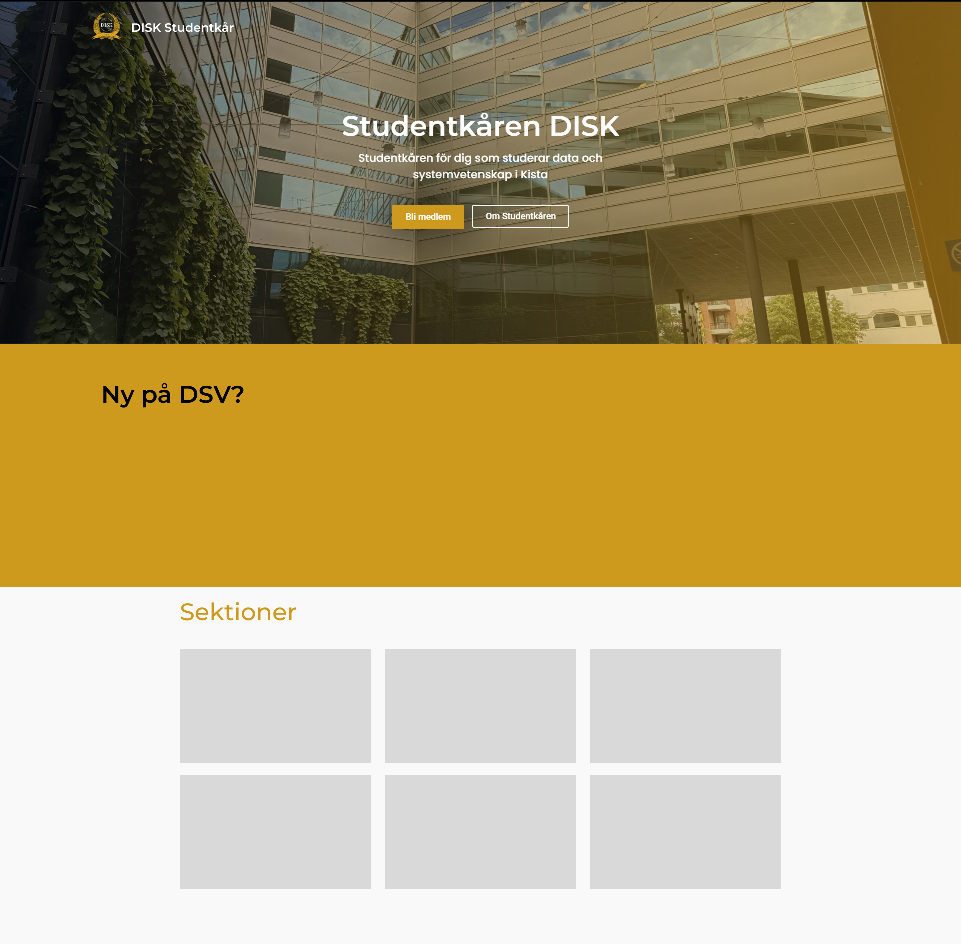
First layout exploration for the main entry point.
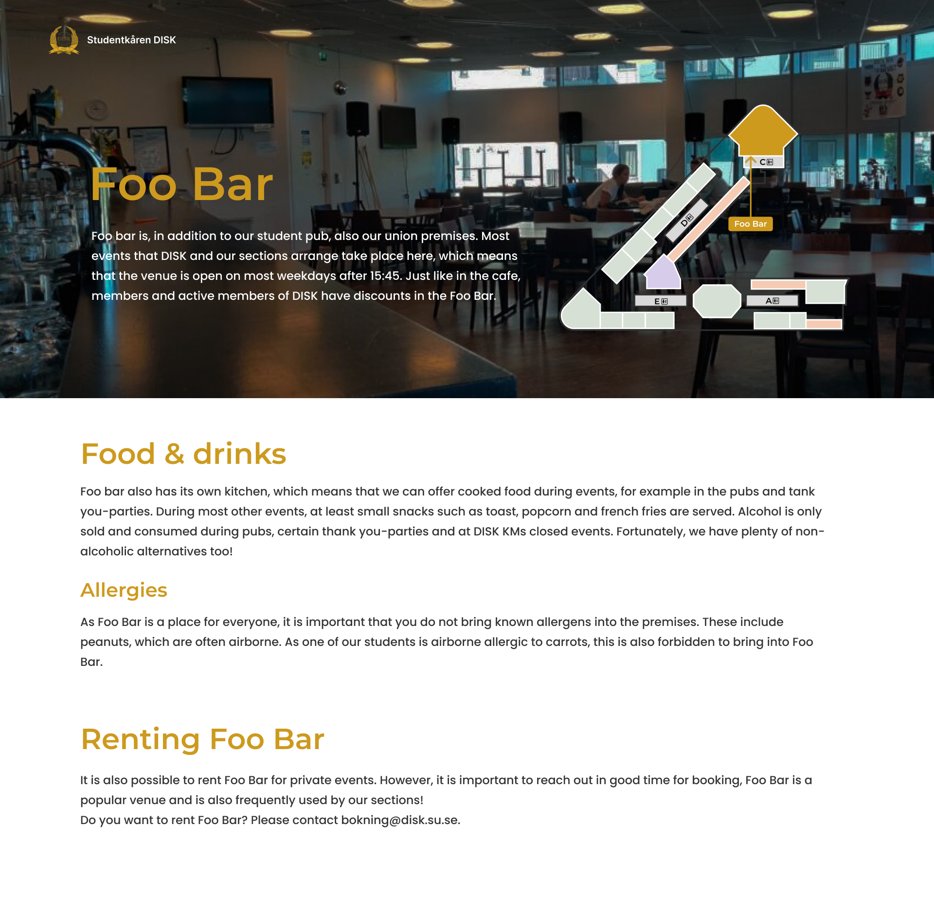
Testing how text-heavy student content could be structured.
The goal was to make the website easier to understand before users started reading in detail. We focused on clearer information hierarchy, more space around content, and layouts that worked better across screen sizes.
We reduced the site structure from 25 pages to 16 by merging overlapping content and grouping related information together. This made the navigation easier to scan, reduced the number of dropdown items on mobile, and created a structure that is easier to maintain in both Swedish and English.
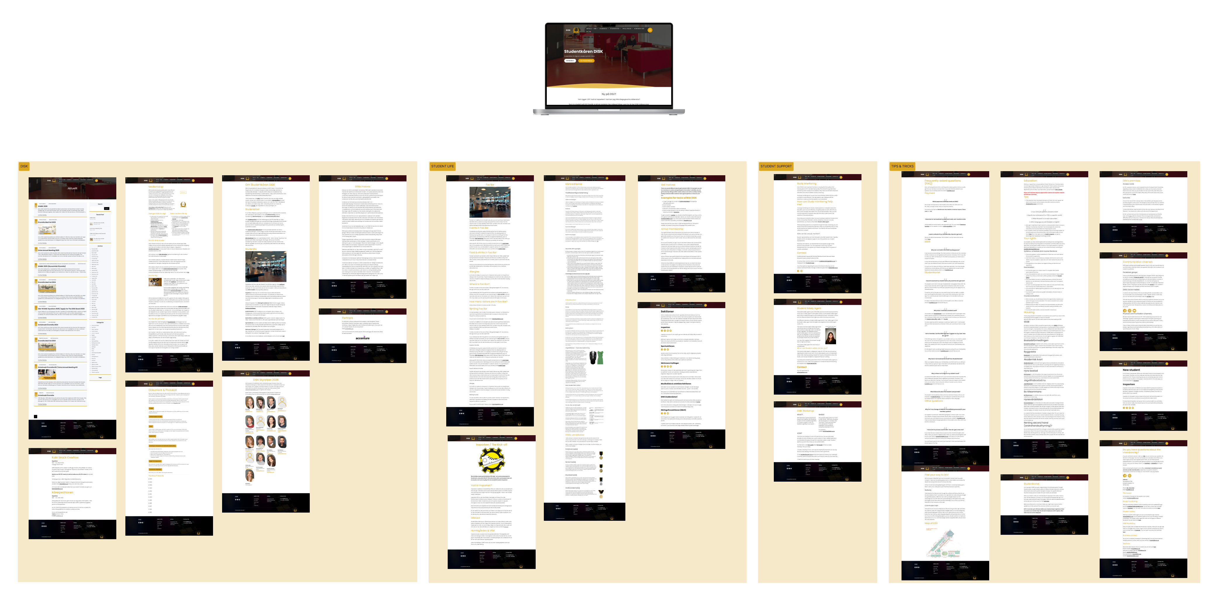
The original structure exposed how much content had accumulated across categories, making the site harder to scan and maintain.
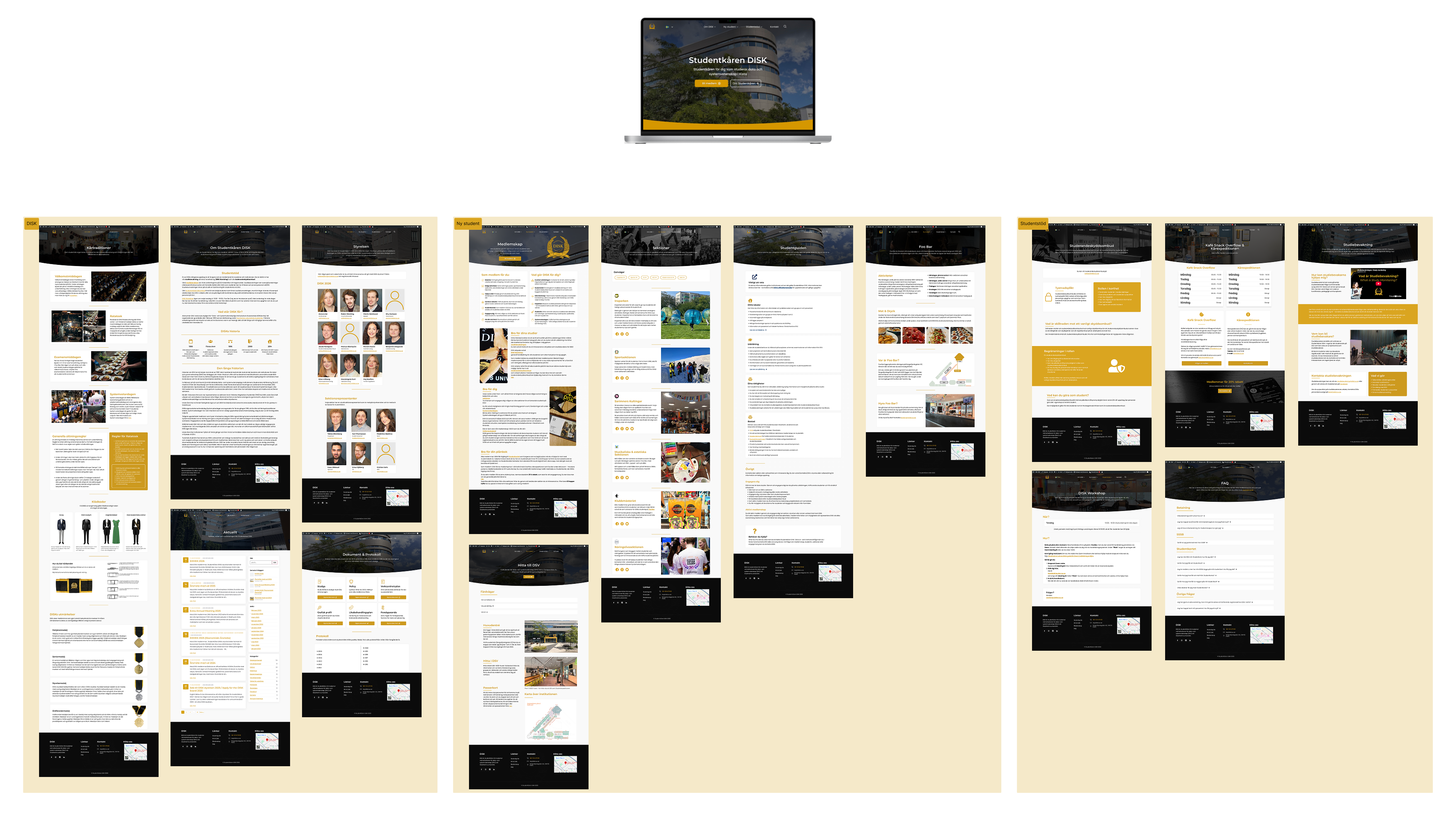
The redesigned structure grouped related information together, reduced overlap, and made common student needs easier to find.
Students should not need to read every paragraph to understand where they are or what to do next. The content hierarchy work focused on turning long, flat pages into sections that could be scanned quickly and maintained more consistently.
Long paragraphs, weak visual breaks, unclear next steps, and important links hidden inside body text.
Related information was grouped into sections such as overview, practical details, actions, and supporting content.
Pages used clearer headings, short introductions, cards, callouts, and visible actions for common student needs.
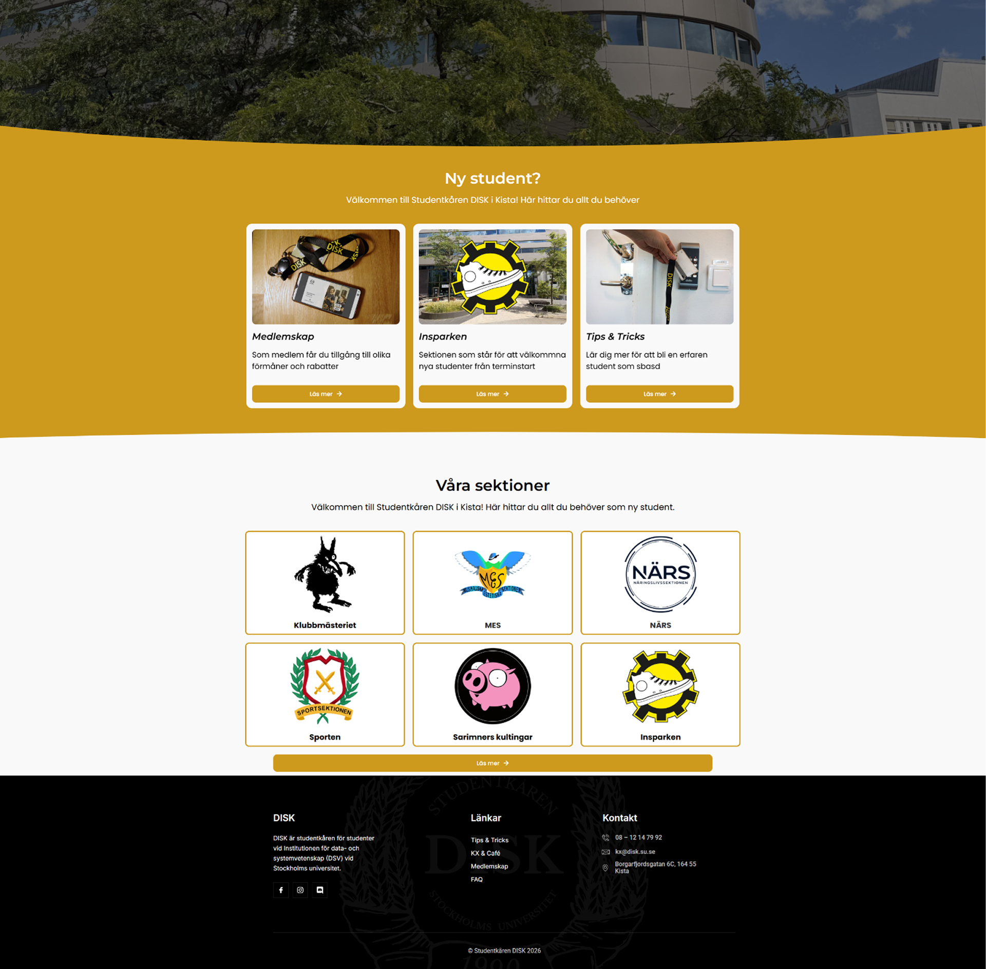
After the early concepts and information architecture work, the homepage direction became more concrete. The refined design used larger content blocks, clearer entry points for new students, and repeated card patterns for sections.
The redesign also had to work within the tools used to build the website. We kept the stack focused around Elementor and used supporting plugins where they solved a clear problem.
Elementor made it possible to build polished pages in a way the client could continue working with after handoff. For the parts that needed more control than the visual editor could provide, I supported the implementation with custom PHP.
Used as the base for page building and the visual structure.
Added more flexible UI blocks and widgets to the build.
Helped create reusable content sections across the site.
Made it easier to manage Swedish and English content.
Supported parts that needed more control than the visual editor provided.
DISK already had an established graphic profile before the redesign. The goal was not to create a new visual identity, but to interpret, structure, and apply the existing profile in a more consistent, modern, and usable way for the web.
The visual identity already existed. The challenge was translating it into a consistent digital system while keeping DISK recognizable through color and typography.
Primary / Brand
Buttons · Highlights · Accents
Primary / Contrast
Headings · Navigation · Strong UI elements
Supporting warmth for surfaces, accents, and visual rhythm.
Heading 01
Heading 02
The typographic sizes were created as a web scale based on DISK's existing typefaces. This helped the redesign keep the original identity while improving hierarchy, contrast, spacing, and component consistency.
The final pages needed to feel like they belonged to the same organization, even when the content changed. By applying DISK's existing colors and typefaces more consistently, the redesign could improve hierarchy, spacing, and component rhythm without replacing the original identity.
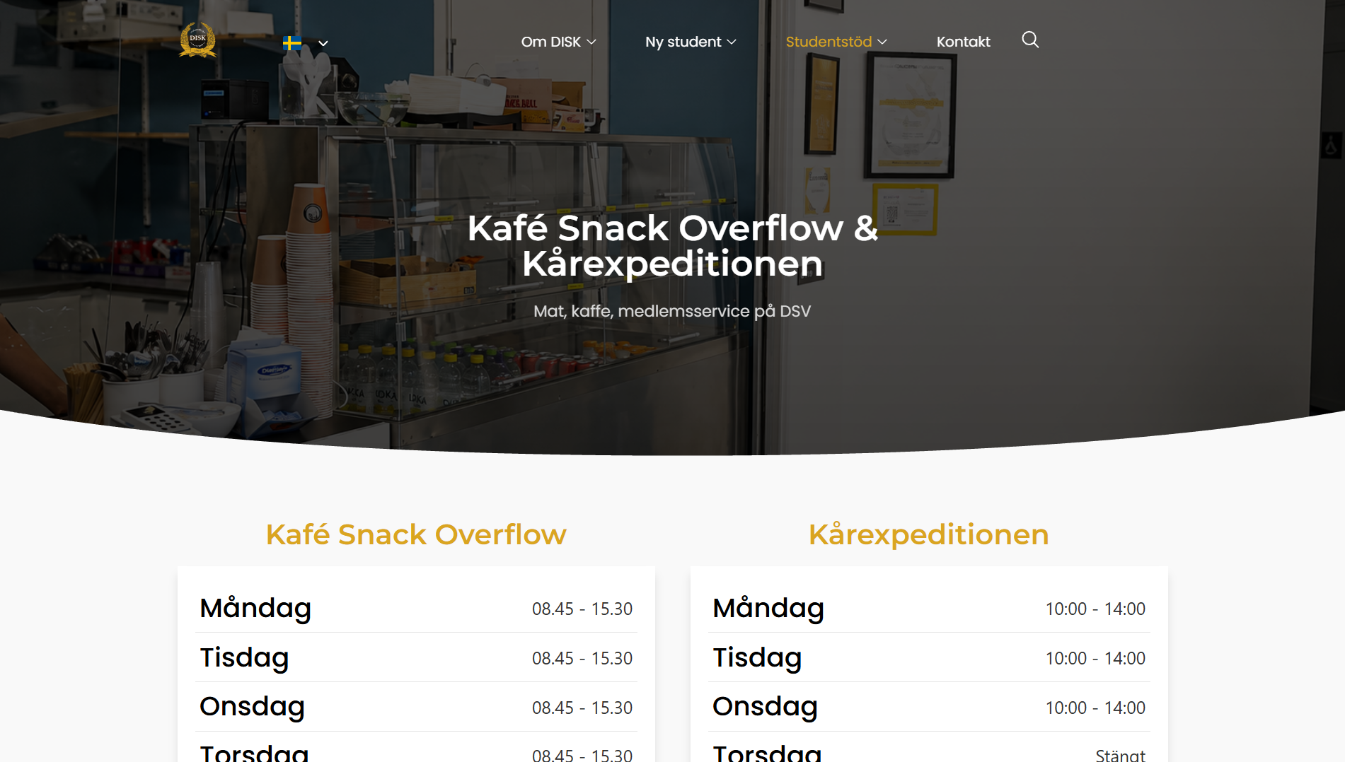
Operational information became easier to scan through larger headings and structured content blocks.
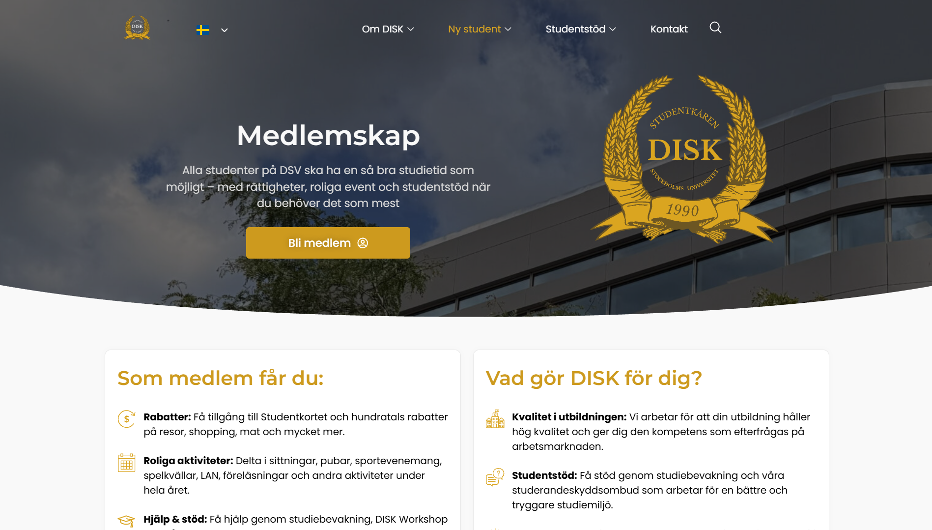
Student benefits and calls to action were made clearer for first-time visitors.
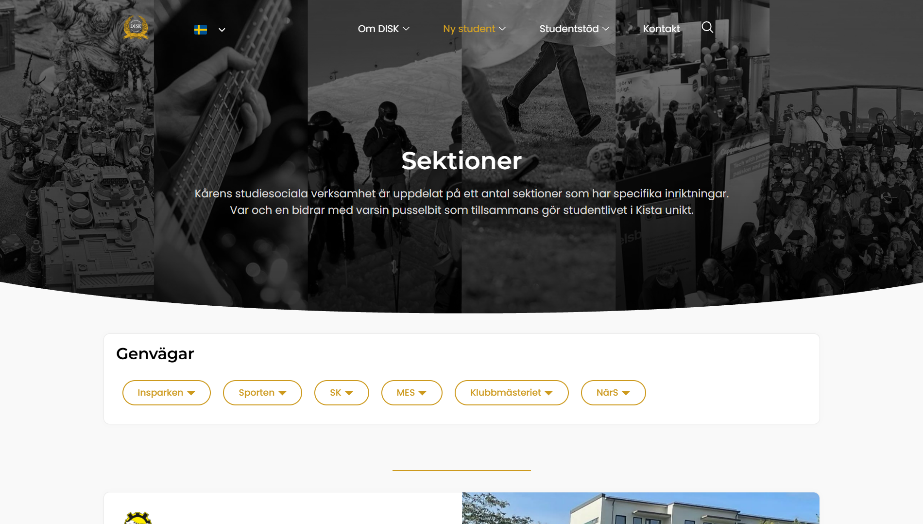
Section discovery was turned into a more visual, scannable entry point.
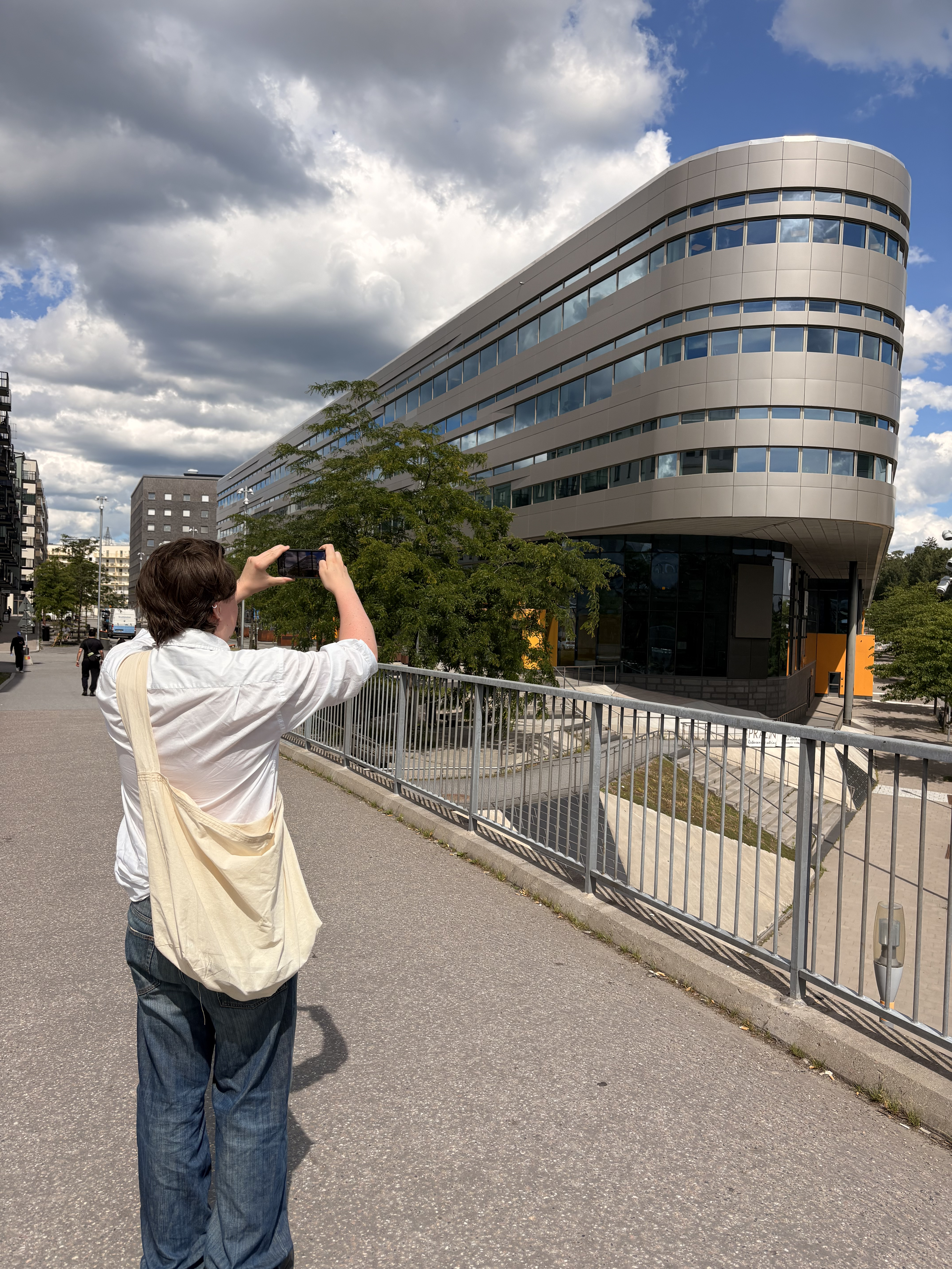
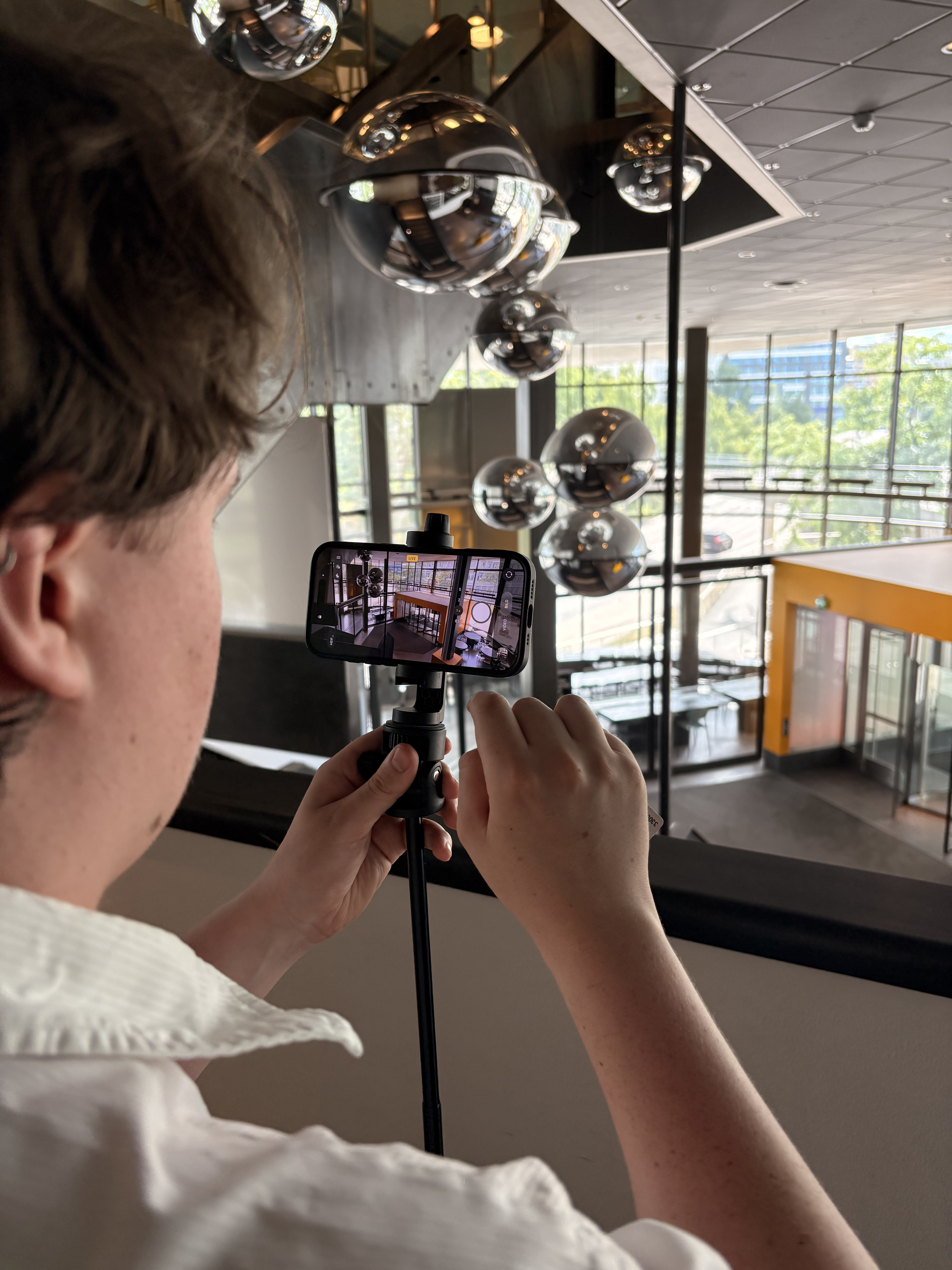
Studio Hackspett also produced visual material for the redesign. The photography helped the website feel connected to the actual DSV environment rather than relying only on generic or outdated imagery.
The site structure went from 25 pages to 16 by merging overlapping content.
Navigation became easier to scan and more focused on common student needs.
Dropdowns, spacing, and page sections were redesigned for smaller screens.
The new structure made Swedish and English content easier to manage consistently.
Text-heavy areas were broken into clearer sections and reusable patterns.
Repeated visual patterns made the website feel more cohesive and trustworthy.
This project showed how much of a redesign happens before the final visual layer. The biggest improvements came from deciding what information students needed first, what could be merged, and how the same structure could stay understandable across devices and languages.