The client
Provider PT offers training and nutrition coaching focused on sustainable results and personal development.
From a coaching offer to a clear digital experience.
UX/UI design and frontend development for a personal training business, from first concepts to a responsive website.
 Personal training & online coaching
Provider PT offers training and nutrition coaching focused on sustainable results and personal development.
Explain several coaching phases and training programmes without overwhelming visitors.
As part of Studio Hackspett, I worked from initial concepts and client feedback through design, development and deployment.
A website built from scratch, bringing coaching services, training programmes and client experiences together.
I began with wireframes in Figma to explore the structure and content hierarchy. The early visual concepts below show how I explored the landing page, programme cards and coaching process, refining the direction through continuous client feedback.
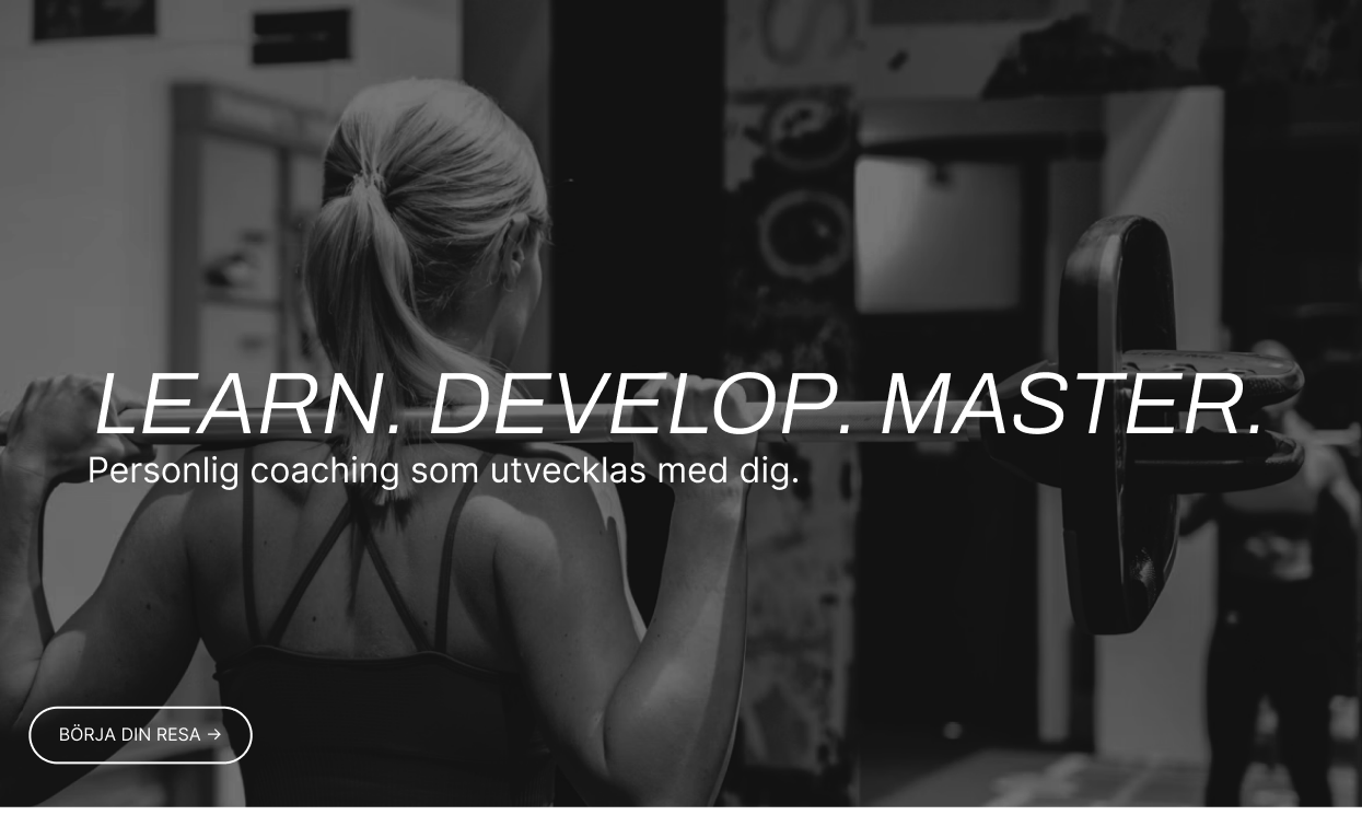
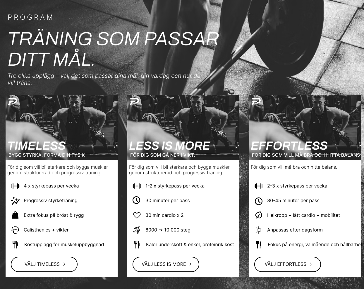
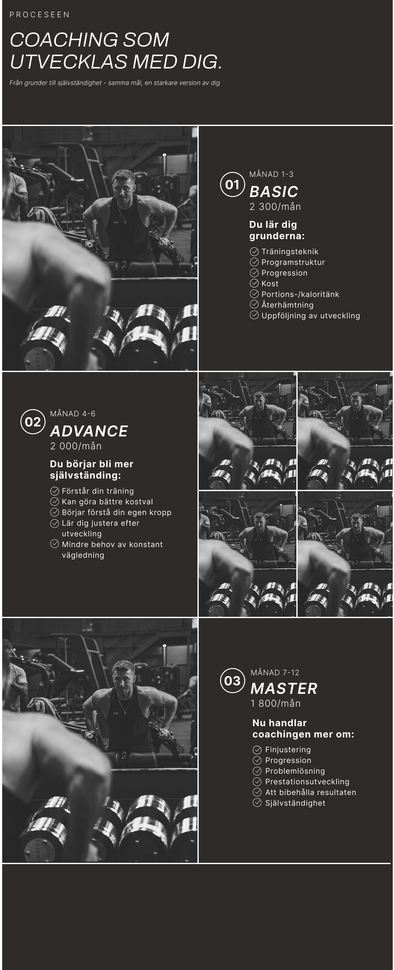
Client feedback shaped a more structured interface: clearer hierarchy, more whitespace and a stronger separation between service information and inspirational photography.
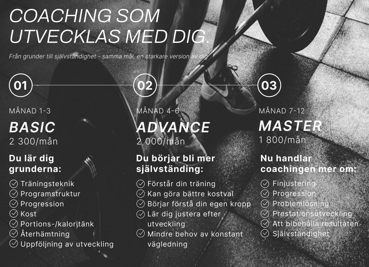
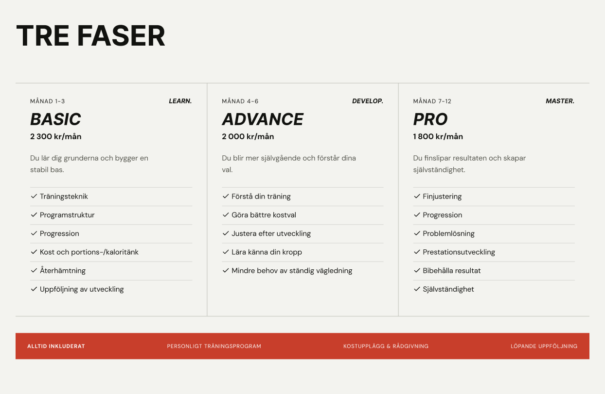
Simplifying the presentation of coaching phases through a clearer visual hierarchy.
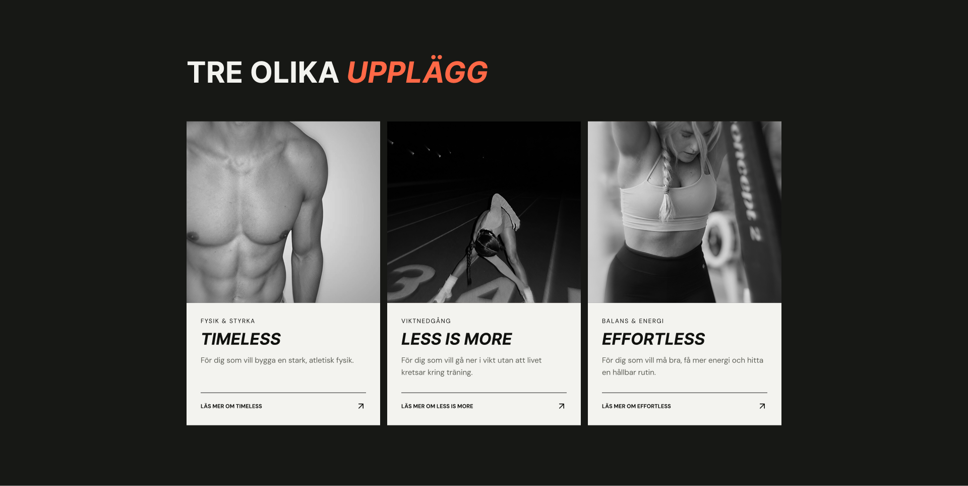
The detailed programme cards above became a concise introduction to each offer. Monochrome photography, bold type and an orange accent create an energetic identity, while consistent cards and links give visitors a clear next step.
I developed the website with React and Vite, translating the Figma concepts into a responsive interface. Working across design and frontend development allowed me to refine layouts during implementation and maintain consistency between the design and the final product.
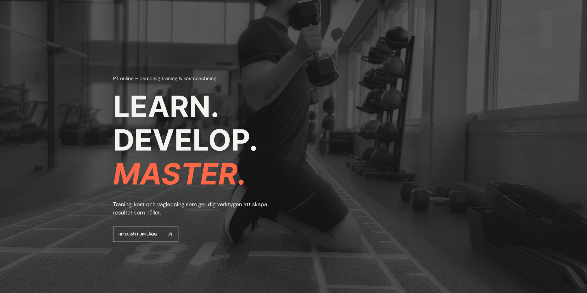
The final website brings together Provider PT’s coaching services, training programmes and client experiences. The client was particularly satisfied with the visual design and the efficiency of delivery.
This project strengthened my ability to translate business requirements into a structured digital experience while balancing visual design, usability and technical implementation.
Taking the project from initial wireframes to a live website deepened my understanding of how design decisions and frontend development shape one another.